Creating our logo with 99designs.com
Anders Eiler
Founder
Sep 29, 2023
The logo is probably 10x more important to me, as the Founder, than to the rest of the world. 90% is good enough. For the last 10%, the time is probably better spent elsewhere. Still, this is how ours was created.
Let me start by being very honest with you: I am no graphic designer. That is probably one of my biggest weaknesses when it comes to running a SaaS business. Therefore, when it became time to create the logo and visual identity for Herodesk back in the summer of 2023, I needed help.
I’ve heard about 99designs.com, but never tried it before. The concept is pretty simple:
- Choose what type of graphic work you need (logo, identity, web, app etc.)
- Upload your brief
- Give feedback on incoming proposals
- Choose a winner and refine the work with the designer
To create the brief I worked with a brand identity framework to put words on the direction and feelings of the brand. It looks like this:
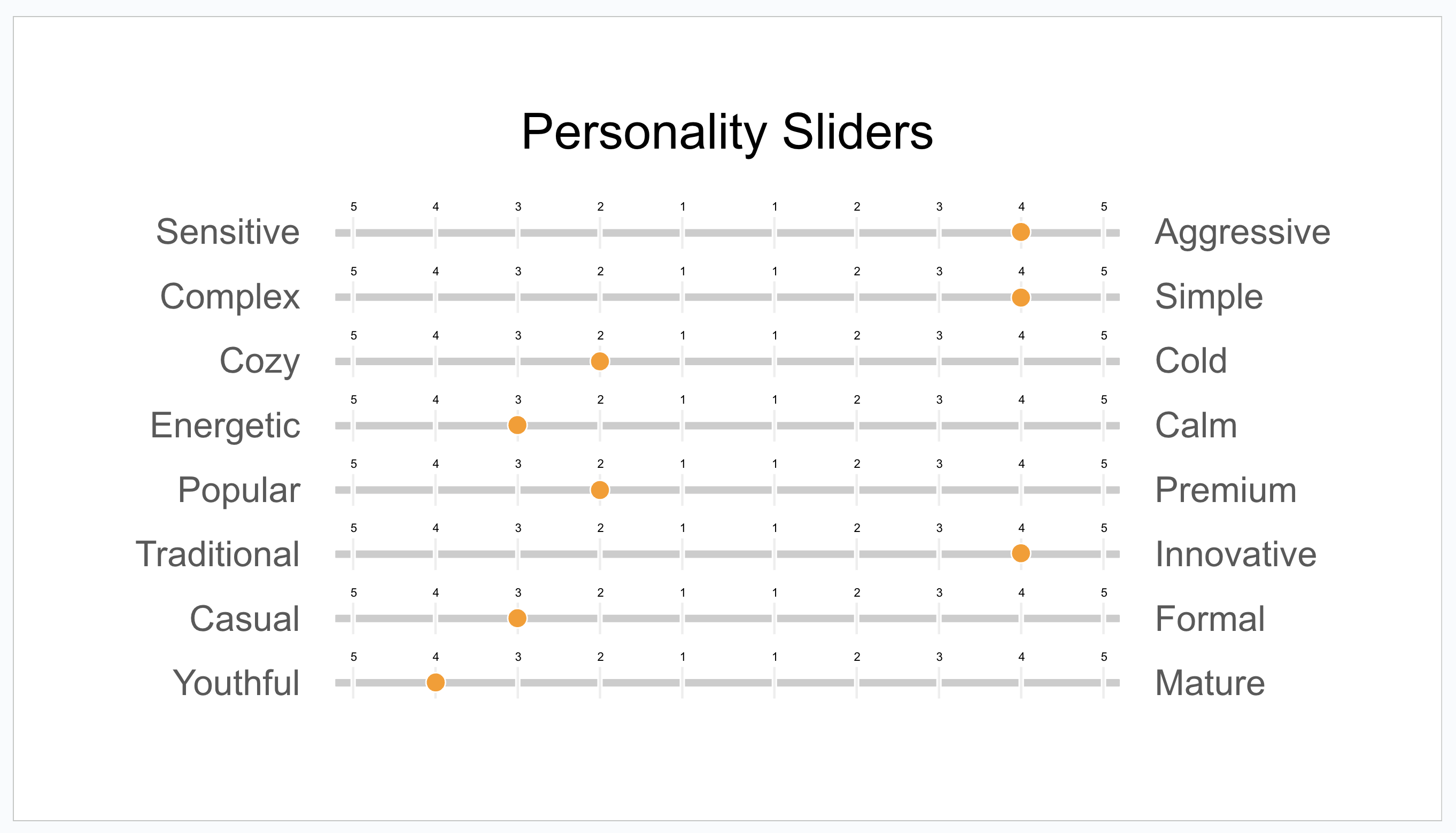 If you want to see the full brand identity brief I used, go to our LinkedIn page and comment “brief me up!” and then I’ll send it to you.
I chose a “premium contest”, to have only mid- and high-level designers participate. I received more than 300 design proposals from more than 100 different designers. That was pretty overwhelming, to say the least. Next up was going through every proposal and selecting the best.
Six designs were chosen to go to the final round. Unfortunately, I can’t share those now (which kind of makes sense, copyright and everything), but it was the six who I felt best grasped the concept, look/feel and identity I was going for. Working with each of them for about a week, trying to narrow in the concept, I finally chose the winner:
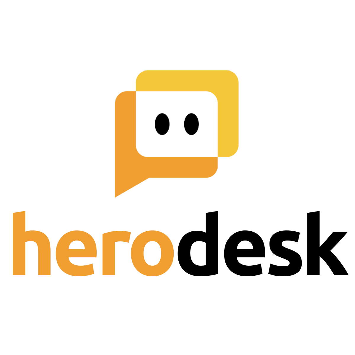
Some of the keywords that I want the logo to represent are: Young, energetic, simple, friendly, welcoming. At the same time trying to avoid corporate, enterprise, stiff and old-school. All of the aforementioned are also how I hope you’ll experience Herodesk going forward.
Finally, I want to share some tips with you, if you want to try out 99designs yourself for graphic work.
- Consider creating a “blind contest”. In a blind contest, the designers cannot see each other’s work. For the first couple of days, my contest wasn’t “blind”, which meant that the designers were inspired by each other’s proposals, not least because they could see which designs I rated highly (you can give 1 to 5 stars to each design), so a lot of new entries were variants of the ones I rated high. My mistake. After it was made “blind” the designs started to vary a lot and each designer had to express his/her own creativity. The winner was submitted after I made the contest blind.
- Check for copy-cats. One of the finalists turned out to be a concept widely used by several companies already, so it was disqualified on that basis. A shame…
- Be thorough and expressive in your brief. The more details you can provide in the brief to express the look, feel and direction of the design you want, the better.
- You learn during the process. Originally I wasn’t looking for an “avatar”, but instead a logo with the name written out and some twist to make it unique. However, as proposals came in, I fell in love with having an avatar - and a proposal with just that ultimately won.
A final thought… The logo is probably 10x more important to me, as the Founder, than to the rest of the world. 90% is good enough. For the last 10%, the time is probably better spent elsewhere. Ultimately, what matters is that the logo and brand identity represents the company, what it does and how it is operated.

 Let me start by being very honest with you: I am no graphic designer. That is probably one of my biggest weaknesses when it comes to running a SaaS business. Therefore, when it became time to create the logo and visual identity for Herodesk back in the summer of 2023, I needed help.

 to stay in touch.

